
Business intelligence dashboard with graphical data visualisation
What is a business intelligence visualisation dashboard and how does it work?
A Business Intelligence (BI) Visualisation Dashboard is a visual representation of key business metrics and data insights. It is an interactive tool that collects, analyses and displays data from various sources in a visually appealing and easy-to-understand format.
The purpose of a BI visualisation dashboard is to help decision-makers and business users to quickly assess business performance, identify trends and make data-driven decisions.
Integrating data lakes with BI dashboards enables organisations to leverage diverse datasets for insightful analysis and reporting, to benefit various users from analysts to business leaders.
Key Features of a BI Dashboard
- Data Integration
A BI dashboard integrates data from different systems, databases, spreadsheetsor applications and combines them into a single view. It can connect to cloud-based systems, internal databases or third-party data sources to inform data analysis. - Visual Elements
You can choose how to visualise data. The dashboard typically displays the raw data through charts, graphs, tables, and other visual formats, including:- Bar Charts and Line Charts
Used for time-based trends and comparisons. - Pie Charts
Display proportional data. - Heat Maps
Show patterns or values in a data matrix. - Tables
Present detailed data for deeper analysis. - Gauges
Indicate performance relative to goals. - Geospatial Maps
Visualise data based on geographic locations.
- Bar Charts and Line Charts
- Real-time Data
BI dashboards display live or real-time data, enabling business leaders to make quick decisions based on the latest available information. - Interactivity
Users can interact with the dashboard by drilling down into specific data points, filtering the data or changing the view to analyse particular segments. This flexibility allows for deeper insights. - Key Performance Indicators (KPIs)
Dashboards highlight KPIs such as sales revenue, customer satisfaction scores, operational efficiency or market share. These KPIs give stakeholders a snapshot of business health. - Alerts and Notifications
BI dashboards can be set up to trigger alerts when certain thresholds are reached, such as a drop in sales or an increase in customer complaints, enabling immediate action.
How BI Dashboards Work
- Data Collection
The first step is collecting data from various sources, such as databases, spreadsheets, cloud platforms and APIs. This data might include sales figures, inventory levels, customer feedback or website traffic. - Data Transformation and Analysis
The raw data often needs to be cleaned and transformed into a format suitable for analysis. This is done through ETL (Extract, Transform, Load) processes, where data is extracted from sources, transformed into a usable format, and then loaded into a data warehouse or BI tool. - Data Modeling
Analysts create data models and relationships between different datasets. For example, they might link customer data with sales data to track purchasing patterns. - Dashboard Design
BI tools allow designers to create customised dashboards by selecting which data to visualise and how to present it. Users can choose from a variety of charts, graphs, and maps to represent different data insights. - Visualisation and Interpretation
The data is then displayed in a way that is easy to interpret, enabling users to identify trends, patterns and areas of concern. - Sharing and Collaboration
Dashboards can be shared with stakeholders in real-time, allowing for collaborative decision-making. Tools also allow users to export reports or integrate with other communication tools.
Benefits of a BI Visualisation Dashboard
- Faster Decision-Making
With visualisations of key data, business leaders can quickly identify issues and opportunities. - Improved Performance Tracking
Dashboards provide a clear view of KPIs, helping organisations track their performance against goals. Integrate with performance tools like Google Analytics and business software such as Microsoft Outlook and Microsoft Dynamics. - Data-Driven Insights
By aggregating and visualising granular data, dashboards empower decision-makers to base their strategies on evidence rather than intuition. - Time Efficiency
Automating the reporting process saves time and reduces the need for manual analysis. - Increased Collaboration
Dashboards enable teams to view the same data and collaborate on strategies.
In summary, a Business Intelligence Visualisation Dashboard is an essential colour coded tool for monitoring business performance and making informed decisions. It combines data integration, visual representation and real-time updates to provide actionable insights to decision-makers.
BI Data Visualisation
Transform your Management Information: Document Logistix business intelligence visualisation dashboard adds real-time clarity and control to your digital document management system. Monitor KPIs in progress.
Anticipate and eliminate issues before they arise – stock levels, complaints, process bottlenecks, overdue receipts and payments, and more.
Capture data from multiple sources and present them visually for easy viewer/user interpretation. Add a traffic light view for critical business operations.
Web Based | Real Time | Graphical | Cross Functional
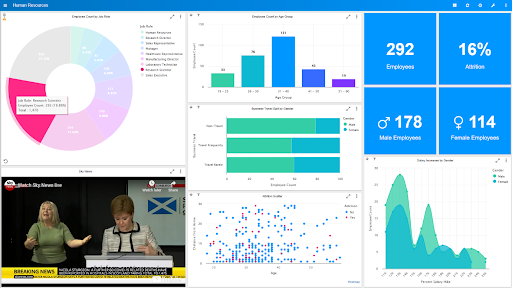
Document Manager Dashboard
DM dashboard is a browser-based application that allows users to access real-time data quickly and present it in customisable and visually appealing charts, tables and speedometers.
You enjoy line-of-sight on the performance of your business across all critical business functions.
Track KPIs, receive alerts and drill down to the underlying data or documents to examine issues. Your DM BI dashboard provides a top down view of your business data and allows you to make proactive, informed business decisions to improve performance, take advantage of favourable market conditions, or head off problems before they arise.
A consolidated view of data streams
Enjoy a single, consolidated view of all your management data by bringing together information from multiple sources to generate business insights. Including: Document Manager, finance and accounting software, HR, payroll, CRM, Service Desk, spreadsheets and ERP.
DM BI dashboard is a simple, intuitive user interface. End users can create dashboards simply by dragging and dropping charts, while new charts are as simple as dragging data columns onto the chart designer panel.
Check out BI dashboard examples and how BI visualisation helps remote teams
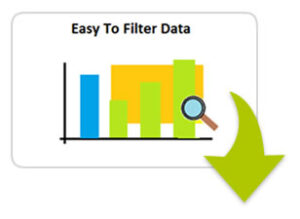
Easy to filter data
No need to analyze data manually. Easily filter the charts to the data you’re interested in.
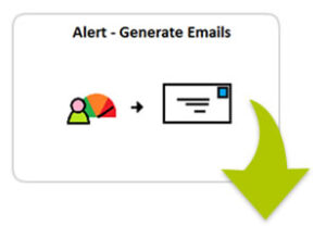
Generate alerts
Dashboard tools include automatic alerts and emails when KPI targets are breached.
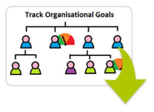
Track goals
Set targets, view tabular data and adjust workloads in real time.
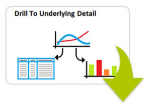
Drill down to underlying detail
Drill down using artificial intelligence from top level numbers to see the underlying data, individual transactions or records.
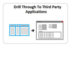
Access third party applications
Open the underlying application screens to view the source of the issues.
Document Management Trends Video


Technical Support
e: support@document-logistix.com
t: UK & Europe 01908 366 722
t: USA +1 (866)865-2476

Easy to filter data
Generate alerts
Track goals
Drill down to underlying detail
Access third party applications